Swipe Button
A swipe-to-confirm button for Jetpack Compose.
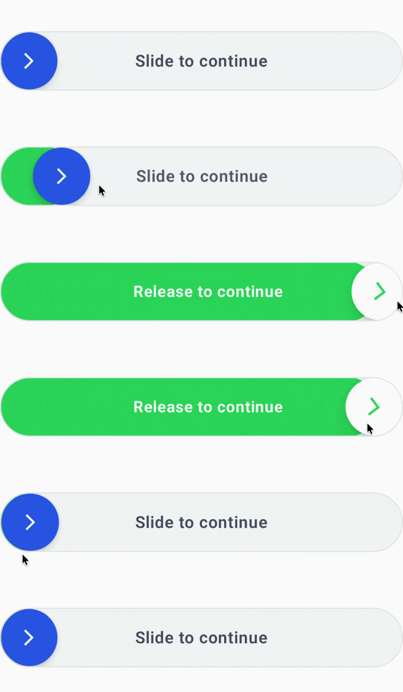
SwipeButton.kt
import androidx.compose.runtime.Composable
import androidx.compose.material.icons.automirrored.filled.KeyboardArrowRight
import androidx.compose.ui.tooling.preview.Preview
import androidx.compose.animation.core.*
import androidx.compose.foundation.background
import androidx.compose.foundation.border
import androidx.compose.foundation.gestures.Orientation
import androidx.compose.foundation.gestures.draggable
import androidx.compose.foundation.gestures.rememberDraggableState
import androidx.compose.foundation.layout.*
import androidx.compose.foundation.shape.CircleShape
import androidx.compose.foundation.shape.RoundedCornerShape
import androidx.compose.material3.Icon
import androidx.compose.material3.Scaffold
import androidx.compose.material3.Text
import androidx.compose.runtime.*
import androidx.compose.ui.Alignment
import androidx.compose.ui.Modifier
import androidx.compose.ui.draw.alpha
import androidx.compose.ui.draw.clip
import androidx.compose.ui.draw.shadow
import androidx.compose.ui.graphics.Color
import androidx.compose.ui.graphics.graphicsLayer
import androidx.compose.ui.platform.LocalDensity
import androidx.compose.ui.text.font.FontWeight
import androidx.compose.ui.unit.IntOffset
import androidx.compose.ui.unit.dp
import androidx.compose.ui.unit.sp
import com.panwar2001.ideapro.core.icons.arrow_forward_ios
import kotlin.math.roundToInt
@Composable
fun SwipeButton(
    text: String,
    onSwipeComplete: () -> Unit,
    modifier: Modifier = Modifier
) {
    val thumbSize = 56.dp
    val trackHeight = 58.dp
    val cornerRadius = trackHeight / 2

    val trackColor = Color(0xFFF1F3F2)
    val progressColor = Color(0xFF22C55E)
    val thumbColor = Color(0xFF2563EB)

    val density = LocalDensity.current
    BoxWithConstraints(
        modifier = modifier
            .fillMaxWidth()
            .height(trackHeight)
            .clip(CircleShape)
            .background(trackColor)
            .border(
                width = 1.dp,
                color = Color(0xFFE2E8E5),
                shape = CircleShape
            ),
        contentAlignment = Alignment.CenterStart
    ) {

        val trackWidthPx = with(density) { maxWidth.toPx() }
        val thumbSizePx = with(density) { thumbSize.toPx() }

        val maxOffset = (trackWidthPx - thumbSizePx)
            .coerceAtLeast(0f)

        var swipeOffset by remember { mutableFloatStateOf(0f) }

        val progress = remember(swipeOffset, maxOffset) {
            if (maxOffset > 0f) {
                (swipeOffset / maxOffset).coerceIn(0f, 1f)
            } else {
                0f
            }
        }

        val isReadyToComplete = progress >= 0.8f

        /*
         * Smooth movement when:
         * - user releases early
         * - swipe completes
         */
        val animatedOffset by animateFloatAsState(
            targetValue = swipeOffset,
            animationSpec = spring(
                dampingRatio = Spring.DampingRatioMediumBouncy,
                stiffness = Spring.StiffnessMediumLow
            ),
            label = "SwipeOffset"
        )

        /*
         * Smooth progress animation.
         */
        val animatedProgress by animateFloatAsState(
            targetValue = progress,
            animationSpec = tween(
                durationMillis = 100,
                easing = LinearOutSlowInEasing
            ),
            label = "SwipeProgress"
        )

        /*
         * Text fades away as the thumb moves.
         */
        val textAlpha by animateFloatAsState(
            targetValue = when {
                isReadyToComplete -> 1f
                else -> 1f - (progress * 1.25f)
            }.coerceIn(0f, 1f),
            animationSpec = tween(120),
            label = "TextAlpha"
        )

        /*
         * Arrow grows slightly near completion.
         */
        val arrowScale by animateFloatAsState(
            targetValue = if (isReadyToComplete) 1.15f else 1f,
            animationSpec = spring(
                dampingRatio = Spring.DampingRatioMediumBouncy
            ),
            label = "ArrowScale"
        )

        /*
         * Green progress layer.
         *
         * It extends underneath the thumb so the
         * thumb feels like it is pushing the progress.
         */
        Box(
            modifier = Modifier
                .fillMaxHeight()
                .width(
                    with(density) {
                        (thumbSizePx / 1.8f + swipeOffset).toDp()
                    }
                )
                .clip(
                    RoundedCornerShape(cornerRadius)
                )
                .background(progressColor)
        )

        /*
         * Center CTA text.
         */
        Text(
            text = if (isReadyToComplete) {
                "Release to continue"
            } else {
                text
            },
            modifier = Modifier
                .align(Alignment.Center)
                .graphicsLayer {
                    translationX = progress * 18f
                    scaleX = 1f - (progress * 0.04f)
                    scaleY = 1f - (progress * 0.04f)
                }
                .alpha(textAlpha),
            color = if(isReadyToComplete) Color.White else Color(0xFF475569) ,
            fontSize = 16.sp,
            fontWeight = FontWeight.SemiBold
        )

        /*
         * Draggable thumb.
         */
        Box(
            modifier = Modifier
                .offset {
                    IntOffset(
                        animatedOffset.roundToInt(),
                        0
                    )
                }
                .size(thumbSize)
                .shadow(
                    elevation = if (isReadyToComplete) {
                        8.dp
                    } else {
                        4.dp
                    },
                    shape = CircleShape,
                    clip = false
                )
                .clip(CircleShape)
                .background(
                    if (isReadyToComplete) {
                        Color.White
                    } else {
                        thumbColor
                    }
                )
                .draggable(
                    orientation = Orientation.Horizontal,
                    state = rememberDraggableState { delta ->
                        swipeOffset = (
                                swipeOffset + delta
                                ).coerceIn(
                                0f,
                                maxOffset
                            )
                    },
                    onDragStopped = {

                        if (progress >= 0.8f) {

                            swipeOffset = maxOffset

                            onSwipeComplete()

                        } else {

                            swipeOffset = 0f
                        }
                    }
                ),
            contentAlignment = Alignment.Center
        ) {

            Icon(
                imageVector = Icons.AutoMirrored.Filled.KeyboardArrowRight,
                contentDescription = null,
                tint = if (isReadyToComplete) {
                    progressColor
                } else {
                    Color.White
                },
                modifier = Modifier
                    .size(19.dp)
                    .graphicsLayer {
                        scaleX = arrowScale
                        scaleY = arrowScale

                        /*
                         * Arrow becomes slightly more
                         * dynamic as the user swipes.
                         */
                        rotationZ = progress * 8f
                    }
            )
        }
    }
}

}